Why Color Matters More Than Shape
Most eyewear advice fixates on face shape: round face gets angular frames, square face gets round frames. That guidance is fine as a starting point, but it misses the factor that has the biggest visual impact: color.
The wrong frame shape still looks decent if the color works. The perfect frame shape in the wrong color looks off in a way most people cannot articulate but everyone notices. Color is the silent variable that separates eyewear that flatters from eyewear that just sits on your face.
Warm vs. Cool: The Foundation
Every skin tone leans warm or cool. This is not about being light or dark, it is about undertone. People across every ethnicity and complexion can have warm, cool, or neutral undertones.
Finding Your Undertone
Three quick tests that actually work:
The vein test. Look at the veins on the inside of your wrist in natural light. Blue or purple veins suggest cool undertones. Green veins suggest warm. If you see both, you are likely neutral.
The jewelry test. Hold a piece of silver jewelry and a piece of gold jewelry against your skin. If silver is more flattering, you lean cool. If gold wins, you lean warm. If both work, neutral.
The white paper test. Hold a sheet of bright white paper next to your face. If your skin looks slightly yellow or peachy by comparison, you are warm. If it looks pink or rosy, you are cool.
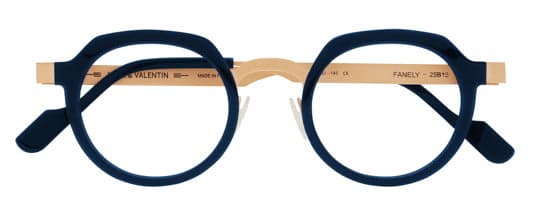
Frame Colors for Warm Undertones
Warm undertones have yellow, golden, or olive base tones in the skin. These complexions come alive next to colors in the same warm family.
Best Frame Colors
- Tortoise shell. The classic for a reason. Rich amber, honey, and brown patterns harmonize naturally with warm skin. Look for tortoise with golden or caramel tones rather than cool gray-brown variations.
- Warm brown. From light caramel to deep espresso, brown frames in warm shades create a cohesive, grounded look.
- Gold metals. Yellow gold, rose gold, and brushed brass tones echo the warmth in your skin.
- Olive and khaki. These muted greens complement olive undertones particularly well.
- Warm red and burgundy. A rich, orange-leaning red or a warm burgundy adds energy without clashing.
- Honey and amber. Translucent warm tones that let light through create a particularly striking effect on warm-toned skin.
Gazal Eyewear is known for acetate palettes that lean into warm territory with unusual depth, think layered tortoise patterns with honey and amber accents that you will not find in standard optical retail.
Colors to Approach Carefully
Cool-leaning silvers, icy blues, and stark black can look harsh against warm skin. They are not off-limits, but they create contrast rather than harmony. If contrast is your goal, go for it intentionally.
Frame Colors for Cool Undertones
Cool undertones have pink, red, or blue base tones. These complexions pair naturally with the cooler side of the color wheel.
Best Frame Colors
- Black. The universal default works particularly well on cool undertones because it does not introduce competing warmth.
- Silver and gunmetal. Cool metals mirror the undertone and feel effortless.
- Gray and slate. From light dove to deep charcoal, cool grays are reliably flattering.
- Blue. Navy, cobalt, and slate blue all complement pink and blue undertones.
- Plum and berry. Deep purple tones harmonize with the natural rosiness in cool skin.
- Cool tortoise. Tortoise patterns with gray, ash, or blue-brown tones work where warm tortoise might not.
- Crystal and clear. Transparent frames are effectively neutral but tend to complement cool tones slightly better because they do not add warmth.
Colors to Approach Carefully
Heavily orange-toned frames, warm yellows, and brassy golds can make cool skin look washed out. Again, not a hard rule, just something to evaluate honestly in a mirror.
Frame Colors for Neutral Undertones
If you tested neutral, congratulations: you have the widest range of flattering options. Neutral undertones balance warm and cool elements, which means most colors work.
The advantage is freedom. The risk is decision paralysis. If you are neutral, focus on:
- What you are drawn to. Instinct is usually right with neutral skin.
- Contrast level. Consider whether you want your frames to blend (colors close to your skin tone) or pop (colors that contrast with your complexion).
- Medium tones. Mid-range colors like teal, dusty rose, warm gray, and classic tortoise tend to be especially versatile on neutral skin.
Beyond Undertone: Contrast and Intensity
Undertone gets you into the right color family. Contrast and intensity fine-tune the selection.
Contrast
Contrast refers to the difference between your skin, hair, and eye colors. High-contrast coloring (dark hair, light skin, bright eyes) can handle bold, saturated frame colors. Low-contrast coloring (similar values across skin, hair, and eyes) tends to look best in softer, more muted tones.
Intensity
Your natural coloring has an intensity level. Vivid coloring, think bright blue eyes or deep black hair, pairs well with saturated frame colors. Softer, muted coloring pairs with frames that have a similar softness, like dusty pastels, faded tortoise, or translucent materials.
Putting It Together: A Practical Process
- Determine your undertone using the tests above.
- Assess your contrast level. Look at a photo of yourself and squint. Do your features create strong value differences or blend together?
- Start with the recommended color families for your undertone.
- Adjust for contrast. High contrast? Go bolder. Low contrast? Go softer.
- Try the frame in natural light. Store lighting lies. Step near a window or ask to take the frame outside for a moment.
- Trust the mirror, not the trend. A color that flatters your specific coloring will always outperform whatever shade is trending this season.
Color as Signature
The most stylish eyewear wearers tend to find two or three frame colors that work for their coloring and rotate between them. One neutral pair for everyday, one with more personality for when they want to make an impression. This approach works because it is grounded in what actually flatters rather than what looked good on someone else.
Brands like Gazal Eyewear design with color as a primary consideration, offering palettes that go well beyond the black-brown-tortoise standard. Exploring those kinds of collections is the fastest way to discover frame colors you never would have tried otherwise.
Find Your Colors
Discover frames in colors that work for you at The View Eyewear. When you know your undertone and contrast level, browsing becomes less overwhelming and a lot more fun.
Newsletter
Independent eyewear, in your inbox
Monthly stories on the world's finest independent eyewear brands and boutiques.
Related Reading
Spring Eyewear Trends 2026: Color, Shape, and Statement
From saturated color to oversized geometry, here are the eyewear trends defining spring 2026 — and the brands leading the way.
Best Winter Frame Colors 2026 — The Palette Boutique Opticians Actually Stock
The real winter 2026 frame palette isn't black. Espresso tortoise, deep teal, burgundy, smoke gray, forest green, champagne gold — with brand and outfit pairings.
Best Fall Frame Tints for Warm Skin Tones — The Honey, Cognac, and Amber Playbook
Warm skin tones shine in fall tortoises. A fitting-counter guide to honey, cognac, and amber acetates — plus the mid-tone shade most people overlook.
Comments
0 comments · moderated
No comments yet. Be the first to weigh in.